

8 Tips and Tricks for Creating Engaging Freelance Infographics
.jpg)
Build with Retainr
Sell your products and services, manage clients, orders, payments, automate your client onboarding and management with your own branded web application.
Get Started1. What are the top tips and tricks for creating engaging freelance infographics?
Understand Your Target Audience
Translating complex data into engaging infographics starts with understanding your target audience. Firstly, define who your main audience will be. This could be based on factors like age, profession etc. Secondly, understand what resonates with them. This is about identifying what gets them engaged, excited or thoughtful. The design elements, content and data you include in your infographic should be tailored to this audience. Lastly, focus on readability. The goal of an infographic is to simplify complicated information, so always remember to keep it reader-friendly.
Follow the Basics of Design
Invest time in mastering the basics of design. Some of the major points to consider while creating infographics are:
- Keep it simple: Clarity should always be prioritized. Don't overcrowd your infographic with too much information.
- Use appropriate colors: The color palette can either make or break your infographic. Use color combinations that are visually appealing and align with the topic of the infographic.
- Focus on hierarchical design: Information should flow in a logical manner. Your most important data should be the focus of your infographic.
- Use varied visuals: Incorporate illustrations, icons, graphs, charts and so on to make your infographic more engaging.
Choose The Right Tools
| Tool | Description |
|---|---|
| Canva | Canva is a user-friendly design tool that provides a wide range of templates for infographics. |
| Visme | Visme enables you to create interactive infographics that allow users to click through different data points. |
| Infogram | Infogram is ideal for creating infographics that contain charts and maps. |
2. How can I make my freelance infographic more engaging?
Utilize Eye-Catching Design
Creating an engaging infographic begins with a visually appealing design. Select vibrant colors that immediately attract attention. Just ensure the colors align with your brand or the theme of the infographic. Additionally, use fonts that are easy to read yet visually stimulating. Also, incorporate shapes and icons to convey your information in a more compelling manner.
- Choose vibrant colors but remember to keep brand consistency
- Select readable yet attractive fonts
- Use shapes and icons to make information interesting to the eye
Focus on Data Visualization
Your infographic's primary function is to present data in a simplified, visually appealing manner. Therefore, ensure your charts, graphs, and data visualization methods are engaging and straight to the point. This will allow your audience to comprehend the information faster and easier. Use a variety of data visualization techniques such as:
| Data Visualization Technique | Description |
|---|---|
| Bar Graphs | Effective for comparing quantities across different categories |
| Pie Charts | Useful for portraying percentage or proportional data |
| Line Graphs | Ideal for demonstrating trends over a specific period |
Keep It Simple
An infographic is meant to simplify complex data, so keep your design clean and your information concise. Don't overload your infographic with too many visuals or text. Instead, keep the features streamlined and the data relevant to the main topic. Here are some key simplicity rules to remember when creating infographics:
- Stick to one main theme or topic
- Ensure visuals enhance understanding, not confusion
- Use minimal textual content
- Keep a logical flow of information
3. How can I use data visualization in my freelance infographics?
Understanding Data Visualization
Firstly, it's essential to understand that data visualization is the graphical representation of information and data. By using visual elements like charts, graphs, and maps, data visualization tools offer an accessible way to see and understand trends, outliers, and patterns in data. As a freelancer, your task is to make complex data easily digestible, presenting it in an appealing, clear, and concise manner. Experiment with different types: bar charts, pie charts, histograms, line graphs, etc.
Applying Data Visualization to Infographics
Applying data visualization in infographics is simple when you break down the process. It starts by:
- Choosing your topic: Make sure your topic is something that can be effectively communicated via data and visuals.
- Gathering data: Reliable, accurate data is key. Your infographic is only as good as the data you’re illustrating.
- Creating your visuals: Use a combination of graphs, charts, and other visuals to tell your story. Ensure they're consistent, attractive, and easy to understand.
- Crafting your narrative: Connect your visuals together by creating a narrative or flow. Guide your audience from one point to the next, making sure each visual builds on the previous.
Data Visualization Case Study
Here's an example of how data visualization can be used effectively in an infographic. Suppose you're creating an infographic about cryptocurrency trends. Let's see how you would present data and visualize it:
| Cryptocurrency | Price (Dec 2020) | Price (Dec 2021) | Change % |
|---|---|---|---|
| Bitcoin | $19,000 | $47,000 | +147% |
| Ethereum | $700 | $3,800 | +442% |
| Litecoin | $79 | $150 | +89% |
This table is an example of simple data visualization that can be integrated into an infographic. It clearly displays data, allowing the viewer to understand and compare the different cryptocurrencies' performance over a year.
4. What software can I use to make high-quality freelance infographics?
Choosing the Right Software for High-Quality Infographics
The appeal of your infographics significantly depends on the software you use. The tool should have an easy-to-understand user interface and offer a rich variety of templates and features. Fortunately, there are a number of software options available for you to utilize.
- Canva: Canva is one of the most popular infographic creation tools, with a plethora of templates, images, fonts, and features making it a go-to choice for many freelancers.
- Piktochart: If you are targeting a professional audience, Piktochart is a top choice. Not only does it offer infographic templates, but it also allows you to make charts and presentations easier.
- Adobe Spark: Adobe Spark is another excellent tool, especially if you are an experienced designer. With various customization options, it enables you to create truly unique and sophisticated infographics.
- Visme: Visme integrates infographic design with analytics, making it an excellent option if you need to deal with data-driven infographics.
| Software | User Level | Key Feature |
|---|---|---|
| Canva | Beginner to Intermediate | Wide range of templates |
| Piktochart | Intermediate | Infographics and Presentations |
| Adobe Spark | Intermediate to Advanced | Advanced customizations |
| Visme | Intermediate to Advanced | Analytics integration |
Though each of these tools are great for creating infographics, remember that the right software for you all depends on your design skills and specific needs of your project. Evaluate each software's learning curve and unique features to determine the best fit for your freelance infographic creation.
5. What are the best design practices for creating engaging infographics?
Stick to a Single Theme
When creating infographics, the rule of thumb is to stick to one theme. This serves to ensure that users easily understand your content. The theme should guide your design choices including colors, typography, and imagery. Straying from one central theme can lead to congestion, making the infographic hard to decipher.
Use of Colors and Typography
Color schemes and typography play a significant role in the readability and overall appeal of your infographics. A strong, well thought out color contrast can enhance understanding. Use a maximum of three main colors in order to prevent overwhelming readers with too many visual stimuli. Typography, on the other hand, should be clear, legible, and large enough to read.
Building Logical Flow and Hierarchy
Your information should not be randomly placed on infographic. Similar to a well-written article, it should flow logically from one piece of information to the next.
- Heading: This is the most visually dominant text in your infographic. It’s typically the largest and plenty bold.
- Subheading: This type of text is still relatively significant, but it’s used to break up different sections or topics within the infographic.
- Body Text: The body text is typically the smallest and it provides the key details or facts that populate your infographic.
6. Can you give examples of engaging infographics created by freelancers?
Examples of Engaging Infographics Created by Freelancers
Infographics serve as a visually enticing means to display information. They help transform dull and at times monotonous information into captivating, attractive visual content. Many freelance designers produce innovative infographics to showcase complex data in an easily digestible and engaging way. Here are some examples of such engaging infographics created by freelancers:
- Ahmed Salama: An infographic titled 'How to Create a Successful Infographic' designed by this Egypt-based graphic designer perfectly exhibits the method to execute an effective infographic from scratch, including color scheme selection, layout designing, chart and icon usage.
- Danielle Hart: The infographic 'The Psychology of Color in Marketing' created by this freelance visual designer is a perfect blend of design techniques. It showcases how different colors influence consumer behavior, with relevant statistics and data, creatively visualized.
- Natasha Bates: An infographic named 'Mental Health in the Workplace' designed by this UK-based freelance designer displays statistics of mental health issues in workplaces, using an engaging design and color scheme to convey a very serious message in an approachable way.
Freelancers frequently use a wide range of design techniques to craft engaging infographics. The table below demonstrates some features commonly used in well-designed infographics.
| Design Feature | Description |
|---|---|
| Color Scheme | The combination of colors used in the infographic which help to evoke a specific mood or attract attention. |
| Typography | Fonts and their arrangement used to make texts visually appealing and easy to read. |
| Icons & Illustrations | Icons are small images used to quickly convey a concept without the use of text. Illustrations are more complex designs that support storytelling. |
| Data Visualization | The use of charts, graphs, and diagrams to visually represent numerical data. |
7. How do I choose the right color scheme for my infographic?
Importance of Choosing the Right Color Scheme
Selecting the right color scheme for your infographic is a critical part of the design process. Colors can help highlight important information, convey a specific mood, and make your information easier to understand. However, choosing the right colors can be tricky, especially if you're not a professional designer. Here are a few tips to help you choose the right color scheme for your infographic:
- Consider the message that you want to convey: different colors can evoke different emotions. For example, red can convey passion or urgency, while blue often denotes trust and calm.
- Use contrasting colors to make important points stand out.
- Don't use too many colors: a good rule of thumb is to use no more than five main colors in your infographic.
Color Scheme Tools for Infographics
There are a variety of tools available to help you choose a color scheme for your infographic. These tools can generate color palettes based on your chosen base color, or you can select from pre-made color schemes.
| Tool Name | Description |
|---|---|
| Adobe Color CC | A tool from Adobe that lets you create, save, and browse color schemes. |
| Coolors | A fast and easy tool to create color scheme. You can browse thousands of color schemes for inspiration. |
| Paletton | A tool that enables you to design color schemes of various types and it includes a simulator for colorblindness. |
Color Accessibility in Infographics
Finally, when selecting a color scheme for your infographic, it's important to take into account color accessibility. This ensures that your infographic is readable and understandable by all viewers, including those with color-blindness or other visual impairments.
- Use a color-blind friendly palette: This ensures that your colors appear distinct to all viewers, including those with color-blindness.
- Consider using patterning in addition to color: This can make your infographic more accessible to those with visual impairments.
- Make sure there’s sufficient contrast between your text and background colors: This makes your text easier to read.
8. What are some tips for writing clear and concise content for infographics?
Clarity and Conciseness in Infographics Content
Clarity and conciseness in infographics is crucial to ensure your message comes across in an engaging manner. The following tips can be helpful:
- Directness: Avoid beating around the bush and go straight to the point. The less words you use to express an idea, the better.
- Eliminate Filler Words: Words such as “really”, “very”, and “just” can be eliminated from your content without affecting the meaning. They only add to the word count.
- Active Voice: Use active voice instead of passive. It's straightforward and easier to understand.
- Keep Sentences Short and Simple: Long complex sentences can be broken down into a series of simple sentences.
| Tip | Description |
|---|---|
| Use Bullet Points | These break down information into easy-to-digest, bite-sized pieces. |
| Avoid Technical Jargon | Unless your audience is highly technical, avoid jargon. It may confuse readers who are unfamiliar with the terms. |
| Use Visuals to Convey Information | Instead of relying solely on text, use visuals like charts, diagrams, and illustrations to convey data. |
Following these tips would help to deliver an engaging and easy-to-follow infographic. Remember, the ultimate goal is to communicate information effectively.
9. How can I optimize my infographic for SEO purposes?
Begin with Keyword Research
Optimizing your infographic for SEO begins with effective keyword research. Use tools like Google's Keyword Planner, SEMRush, or Moz’s Keyword Explorer to identify the right keywords relevant to your infographic's content. These keywords should be incorporated strategically in your infographic’s title, file name, alt text, and the supporting text.
- Infographic's title: Keep it short, interesting, and keyword-rich.
- File Name: Use descriptive, concise and keyword-rich file names.
- Alt Text: This is the description that gets displayed when the image doesn't load. It should be precise, descriptive and include your main keywords.
- Supporting Text: Surround your infographic with content that utilises your keywords naturally.
Use an SEO-Friendly Embed Code
Supplying an SEO-friendly embed code with your infographic makes it easier for others to share, helping you get backlinks which are crucial for SEO. In this code, make sure the alt text and title tag associated with the embedded image are optimised with your keywords.
    <!-- Replace 'src', 'alternate text', and 'hyperlink' -->
    <a href='your-infographic-url'>
    <img src='your-image-url' alt='alternate text with keywords' />
    </a>
Take Advantage of Social Media
Sharing your infographic on social media platforms can increase its visibility, leading to more traffic and potential backlinks. To further boost SEO, make sure the semantics like title, description, and tags while sharing are properly optimised with your chosen keywords. Below is a suitable format:
| Social Media Element | Optimisation Tip |
|---|---|
| Title | Ensure your title is catchy, relevant and includes your main keywords. |
| Description | Use this space to elaborate on the infographic, using related keywords naturally. |
| Tags | With tags, use broader keywords that are related to your content. |
10. How can I incorporate interactivity into my freelance infographics?
Incorporating Interactivity into Freelance Infographics
Interactivity can significantly enhance the effectiveness of your freelance infographics. Interactive elements can engage the audience, increase information retention, and make your content more shareable. In this sense, here are some ways to integrate interactivity into your infographics:
- Layered Information: This approach involves presenting information in layers, with the main points being easily noticeable and additional details being revealed when the user interacts with the infographic. This can be done using tooltips or hidden panels.
- Animated Elements: Animation can draw attention and demonstrate processes or changes over time in a compelling way. You can animate graphs, charts, or individual graphic elements.
- Quiz or Poll: Encouraging the audience to engage directly with content increases retention. A short quiz or poll related to your infographic topic can be very effective.
- Scrolling Effects: Some infographics can incorporate parallax scrolling, where background images move slower than foreground images, creating a 3D effect and adding depth to the infographic.
Detailed Guidelines for Interactive Elements
Taking a deeper look at these interactive elements, here are more detailed guidelines:
| Interactive Element | Guidelines |
|---|---|
| Layered Information | Ensure the additional information is relevant and when displayed, it does not obstruct other parts of the infographic. |
| Animated Elements | Keep animations simple and purposeful. Overdoing can distract from your message. |
| Quiz or Poll | Keep it short and simple. Make sure the results contribute to your overall message. |
| Scrolling Effects | Use sparingly to avoid confusion. Ensure mobile users can also enjoy this effect. |
Tips for Tools and Platforms
Last but not least, a key to successfully incorporating interactivity into your infographics is choosing the right tools and platforms. Some recommended options are:
- Adobe Photoshop/Illustrator: These platforms are beneficial for creating animated infographics.
- Canva: Canva is a beginner-friendly tool that offers options for creating interactive infographics.
- Visme/Infogram: These services provide lots of templates and also allow for creating interactive charts and diagrams.
- Google Charts: This is a powerful tool if you plan to incorporate interactive charts in your infographic.
Conclusion
Mastering the Art of Freelance Infographics
Creating engaging freelance infographics requires knowledge, creativity, and the right tools. With these 8 tips, you will be able to create powerful visual content that captivates your audience: understand your audience, choose your design carefully, use data visualization, focus on storytelling, keep it simple, use attractive and contrasting colours, edit and proofread, and use the right tools.
Choosing the Right Tool
One vital step in creating compelling infographics is the use of the right tool. You need a software that can provide a streamlined process and deliver top-notch results. That's where Retainr.io comes in. It is a whitelabel software to Sell, Manage Clients, Orders & Payments with Your Own Branded App. By using Retainr.io, you will save time, improve efficiency, and be able to focus on creating amazing infographics.
Why Choose Retainr.io
With Retainr.io, you get more than just a design tool. You get a comprehensive platform that simplifies the business side of freelance work. Through its user-friendly interface, you can efficiently manage your clients, orders, and payments. Plus, you can do all these under your own brand. So why not give Retainr.io a try today and elevate your infographic design game?
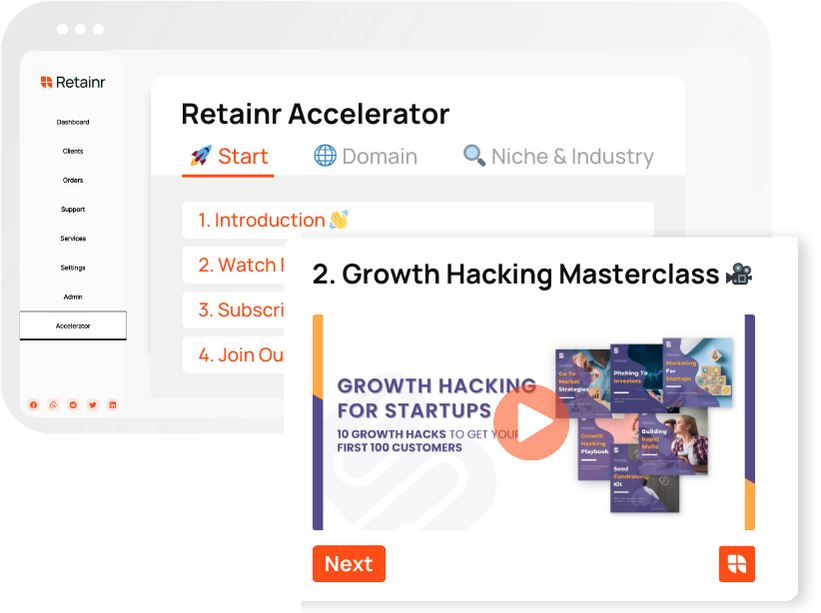
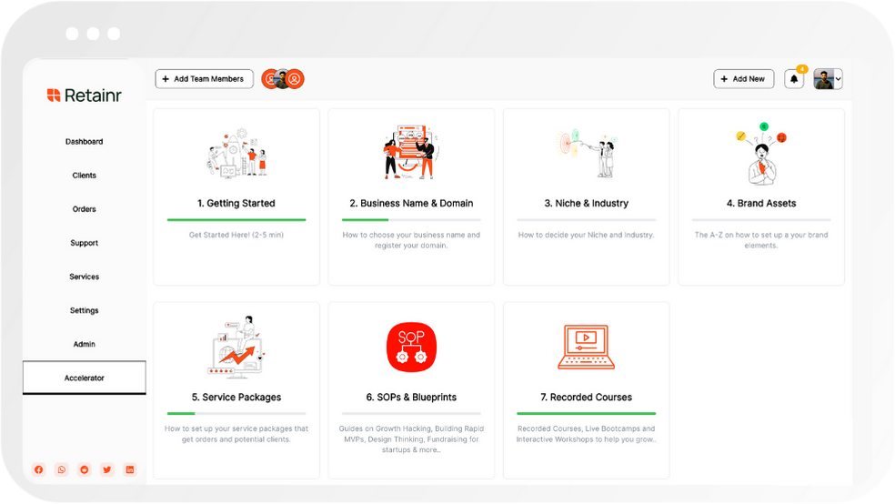
Boost Your Agency Growth
with Retainr Accelerator
Uncover secrets, strategies, and exclusive blueprints to take your agency's growth to the next level — from marketing insights to effective presentations and leveraging technology.
SOPs, Cheatsheets & Blueprints
Leverage 50+ SOPs (valued over $10K) offering practical guides, scripts, tools, hacks, templates, and cheat sheets to fast-track your startup's growth.
Connect with fellow entrepreneurs, share experiences, and get expert insights within our exclusive Facebook community.
.jpg)
Join a thriving community of growth hackers. Network, collaborate, and learn from like-minded entrepreneurs on a lifelong journey to success.
Gain expertise with recorded Courses, Live Bootcamps and interactive Workshops on topics like growth hacking, copywriting, no-code funnel building, performance marketing and more, taught by seasoned coaches & industry experts.

.jpeg)


